
 Tools
Tools Tools
Tools


Baines, Phil (2005) Cover Designs for Penguin Books: Great Ideas series. [Art/Design Item]
![[img]](https://ualresearchonline.arts.ac.uk/1059/41.haslightboxThumbnailVersion/GI_01Seneca.jpg)

![[img]](https://ualresearchonline.arts.ac.uk/1059/46.haslightboxThumbnailVersion/GI_2_25.jpg)
![[img]](https://ualresearchonline.arts.ac.uk/1059/51.haslightboxThumbnailVersion/GI_2_27.jpg)
![[img]](https://ualresearchonline.arts.ac.uk/1059/55.haslightboxThumbnailVersion/GI_2_29.jpg)
![[img]](https://ualresearchonline.arts.ac.uk/1059/58.haslightboxThumbnailVersion/GI_2_35.jpg)
![[img]](https://ualresearchonline.arts.ac.uk/1059/62.haslightboxThumbnailVersion/GI_02Aurelius.jpg)
![[img]](https://ualresearchonline.arts.ac.uk/1059/66.haslightboxThumbnailVersion/GI_03StAugustine.jpg)
![[img]](https://ualresearchonline.arts.ac.uk/1059/68.haslightboxThumbnailVersion/GI_09Gibbon.jpg)
| Type of Research: | Art/Design Item |
|---|---|
| Creators: | Baines, Phil |
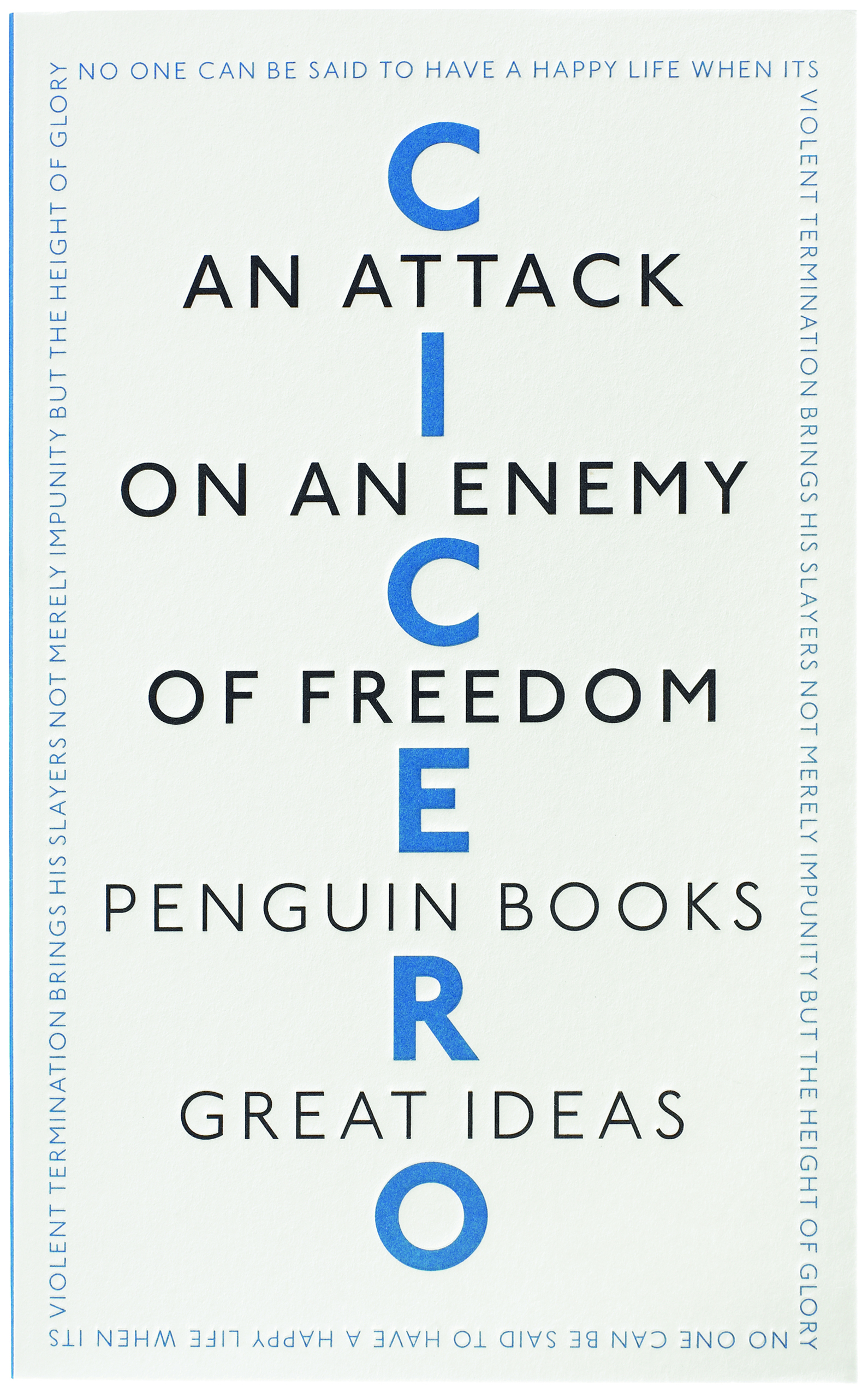
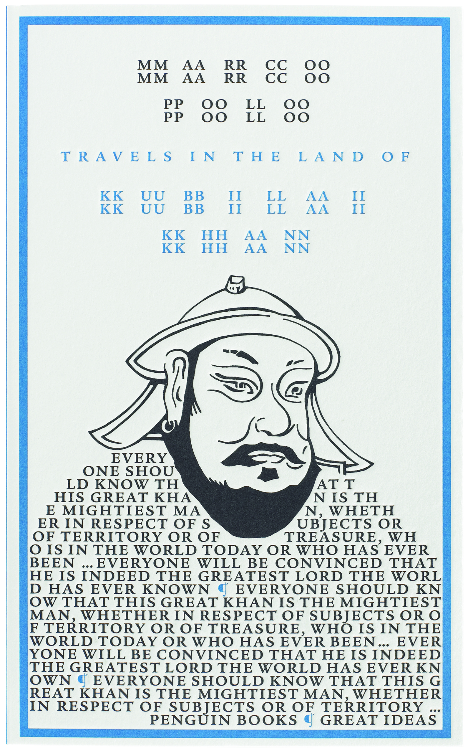
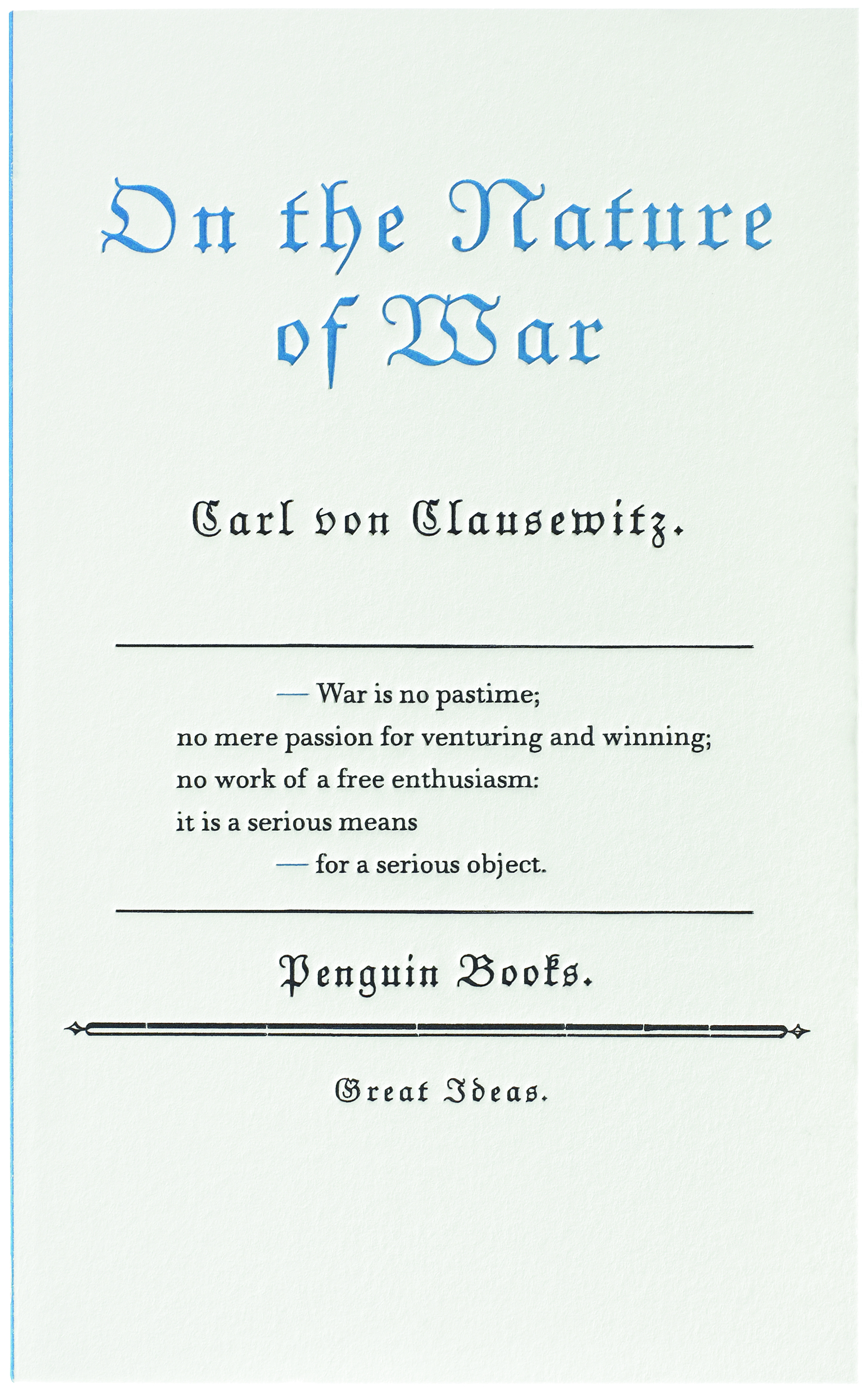
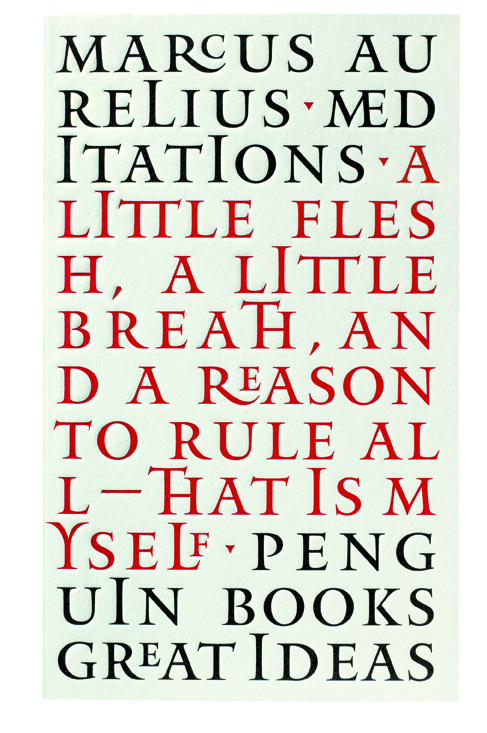
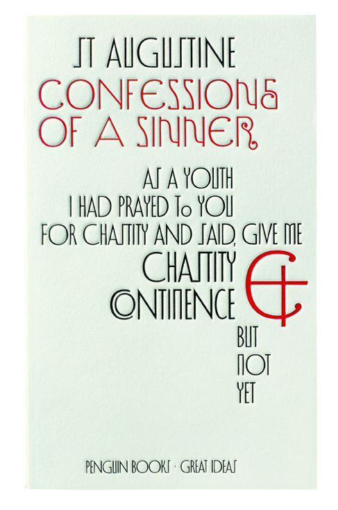
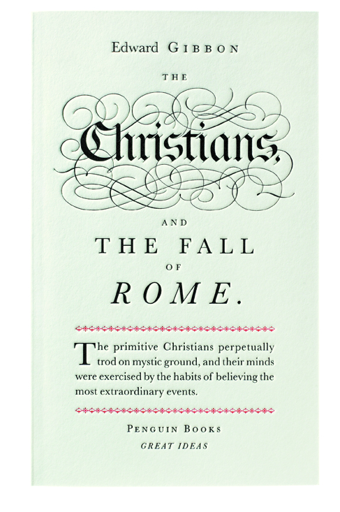
| Description: | The original series concept and brief for 'Great Ideas' came from Penguin Press Art Director Jim Stoddart and designer David Pearson. They wanted something akin to title page designs contemporary with the writing of each title and to use a restricted colour palette. Catherine Dixon and I provided historical guidelines and suggestions about research resources and were commissioned, along with Alistair Hall, to design covers. Although a strong sense of history is suggested by the covers there is considerable variance in how strictly we observed particular models. Of my designs, Gibbon is an accurate recreation of John Baskerville's Holy Bible title page of 1763 but Marco Polo is a freer interpretation of some of the kind of text/image play. Although typographic covers for paperbacks are not new, the starkness of these designs, together with the accuracy of reference and quality of execution sets these apart from anything else in bookshops. The first series outsold expectations twenty-fold and the design team were nominated for the Design Museum's Designer of the Year Award in 2005. They won a D&AD Silver Award for Best Cover Design in 2005 and a nomination in the Typography category in 2006. |
| Additional Information (Publicly available): | My design practice includes high profile, one-off commissions; general graphic design for arts organisations; and type design. Underlying themes include an interest in history & experimentation, and in the relationship between form & content. History & experimentation are most obvious in the award-winning Great Ideas cover designs for Penguin Books. Two series of these have been published (2004 & 2005) and a third is being prepared. Ideas about form and content inform my approach to book and publication design and vary according to the requirements of a particular client. For some, my hand is almost invisible and the design arises out of careful collaborative discussions between myself, the gallery, and the artist or curator as appropriate; on other occasions, a more subjective approach is taken. |
| Your affiliations with UAL: | Colleges > Central Saint Martins |
| Date: | 1 January 2005 |
| Copyright Holders: | All designs are copyrighted by Penguin Books. |
| Related Websites: | http://www.penguin.co.uk/static/cs/uk/0/minisites/greatideas/index_1.html |
| Related Websites: | |
| Date Deposited: | 07 Dec 2009 09:23 |
| Last Modified: | 09 Nov 2023 04:46 |
| Item ID: | 1059 |
| URI: | https://ualresearchonline.arts.ac.uk/id/eprint/1059 |
| Licences: |
Repository Staff Only: item control page | University Staff: Request a correction