Winter 2010
Graphic language
Tony Pritchard swears by the elemental beauty of the Periodic Table
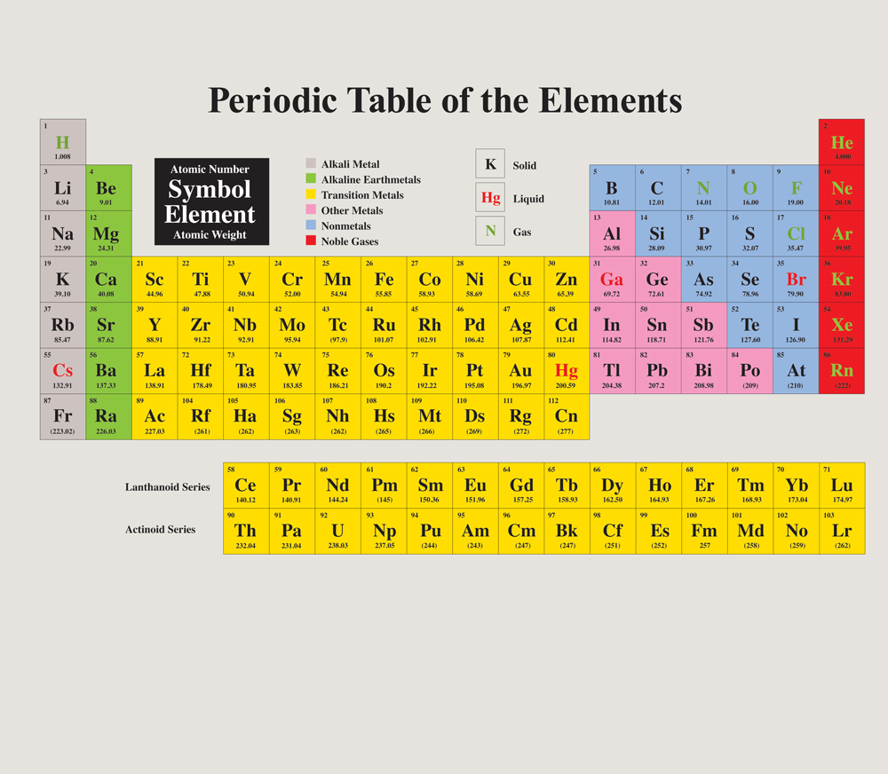
The innovation of the periodic table of chemical elements, largely credited to Russian scientist Dmitri Mendeleyev, was that all known elements – and those that were yet to be discovered – could be accommodated within a single design that enables vertical and horizontal cross-referencing.
Elements are organised in horizontal rows, known as ‘periods’, by their increasing atomic numbers. The vertical columns, ‘groups’, represent elements with similar electronic structures and properties (gases, solids, liquids, metals, etc.) Elements within each group have the same number of outer electrons.
Colour and graphic coding have been added to further define sub-categories of classification, such as the actinides, which include uranium and other elements that are produced by (or are involved in) nuclear reactions.
The table was also used to predict elements not yet discovered or naturally occurring.
There is a suggestion that Mendeleyev was inspired by the game of Patience, in which cards are arranged in suits horizontally and by descending number vertically. But the visual form is determined by the meaning of the information and how best it can be accessed and used, not by aesthetic concerns.
Data visualisation has often been adopted by professionals from fields other than design. Dr John Snow’s celebrated 1854 cholera map of London and Florence Nightingale’s ‘Diagram of the causes of mortality in the army in the East’ come to mind.
Information designers have employed similar methods to that of the periodic table in arranging and presenting complex information. In 1993 the Institute for the Study of Drug Dependence updated its Drug Misuse Chart to clarify the relationship of drug groups (horizontal rows) to categories such as legal status, the effects of short- and long-term use and the routes of administration (vertical columns).
When it comes to organising complex information, the static print diagram has its limitations. But developments within screen interaction have enabled vast databases of digital information to be presented in meaningful ways. The University of Nottingham has produced an interactive periodic table, which includes online videos made about each element (periodicvideos.com/index.htm).
Ben Shneiderman set his Human-Computer Interaction Lab at the University of Maryland to work on a potential interface to a database of 10,000 films. Films were organised chronologically but also categorised by genre, using colour coding (comedy was pink, musicals were yellow, etc.). Interactive onscreen sliders enabled users to choose films alphabetically or by actors and directors. Films could be accessed by rating or duration.
The form of the periodic table, beyond its function of visual explanation, continues to exert an appeal to scientist and layperson alike. Mark R. Leach has made it his quest to compile an online database of variants over the past ten years (see The Chemogenesis Web Book on meta-synthesis.com).
In his book A Short History of Everything Bill Bryson describes the periodic table as a ‘thing of beauty in the abstract’, but adds that for chemists ‘it established an immediate orderliness and clarity that can hardly be overstated.’
Artists and designers fascinated by the periodic table have used it primarily as a visual signifier and celebration of form. Jon Link and Mick Bunnage of Modern Toss (see Eye 75) mix what designer and academic David Crow terms ‘official and unofficial visual language’ in the Periodic Table of Swearing. What initially appears as an attractive and informative display reveals itself as something more confrontational in content. And Lucienne Roberts, working with writer Tom Lynham, produced a personal and poignant response to the notion of a periodic table of emotions for the book 26 Letters: Illuminating the Alphabet (2004).
The periodic table is not only a classic of information design but arguably one of the top ten designs ever. It established a template for organisational thinking and visualisation, and the beauty of its form is intrinsic to its function.
Tony Pritchard specialises in information and identity design and runs courses at the London College of Communication.
First published in Eye no. 78 vol. 20.